Something very important to us at Coffee Made Better is portraying the entire story of coffee from crop to cup. We desperately want our readers to understand how amazing it is that we can have something such as coffee that we take for granted.
The story of coffee is one that deals with farmers working long hours in the fields to feed their families, roasters meticulously manipulating variables to preserve the delicate flavors of the bean, and baristas and home brewers testing their skills using various techniques to produce the end result of an excellent cup of coffee.
Every stage of the coffee journey is absolutely critical to the end result. This is what we wanted to express in our logo.
We reached out to Angel Martinez to begin talking through logo ideas that would capture this vision. Angel stood out to us initially as he is certainly not new to the world of coffee. As a dedicated homebrewer himself, Angel seldom makes a logo for a company without pounding out variables on his Aeropress or V60 first to give him the fuel.
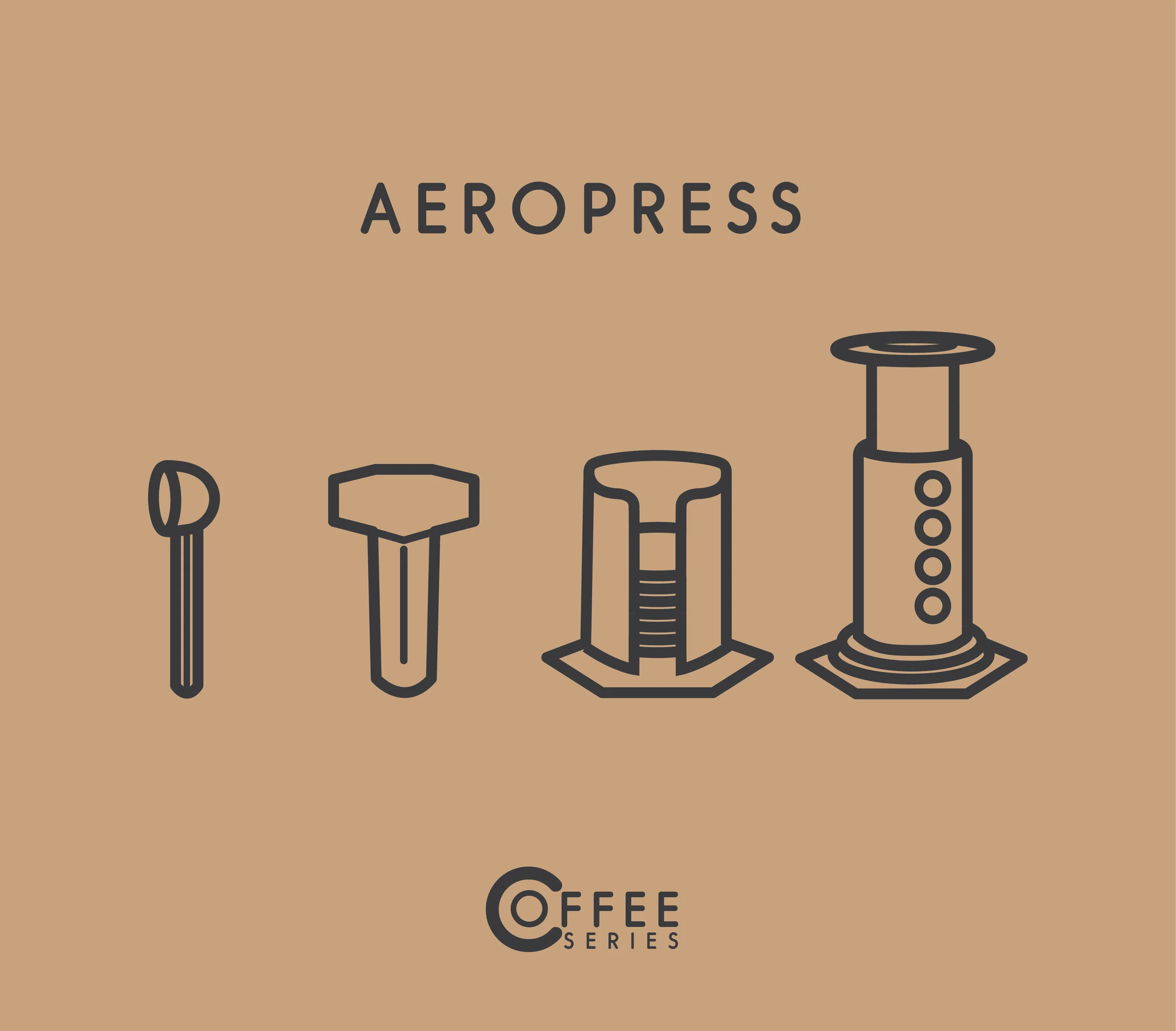

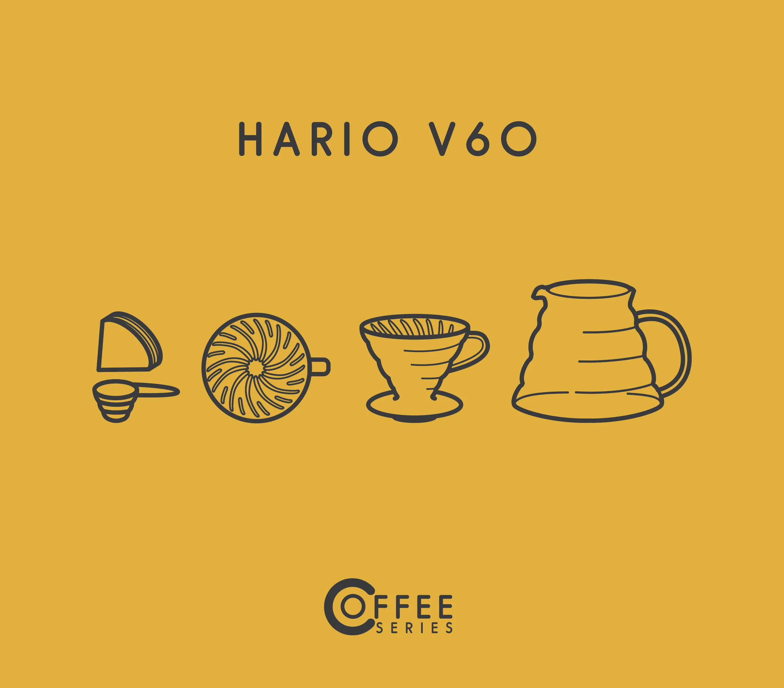

(Pictured Above: Angel’s Coffee Series design work)
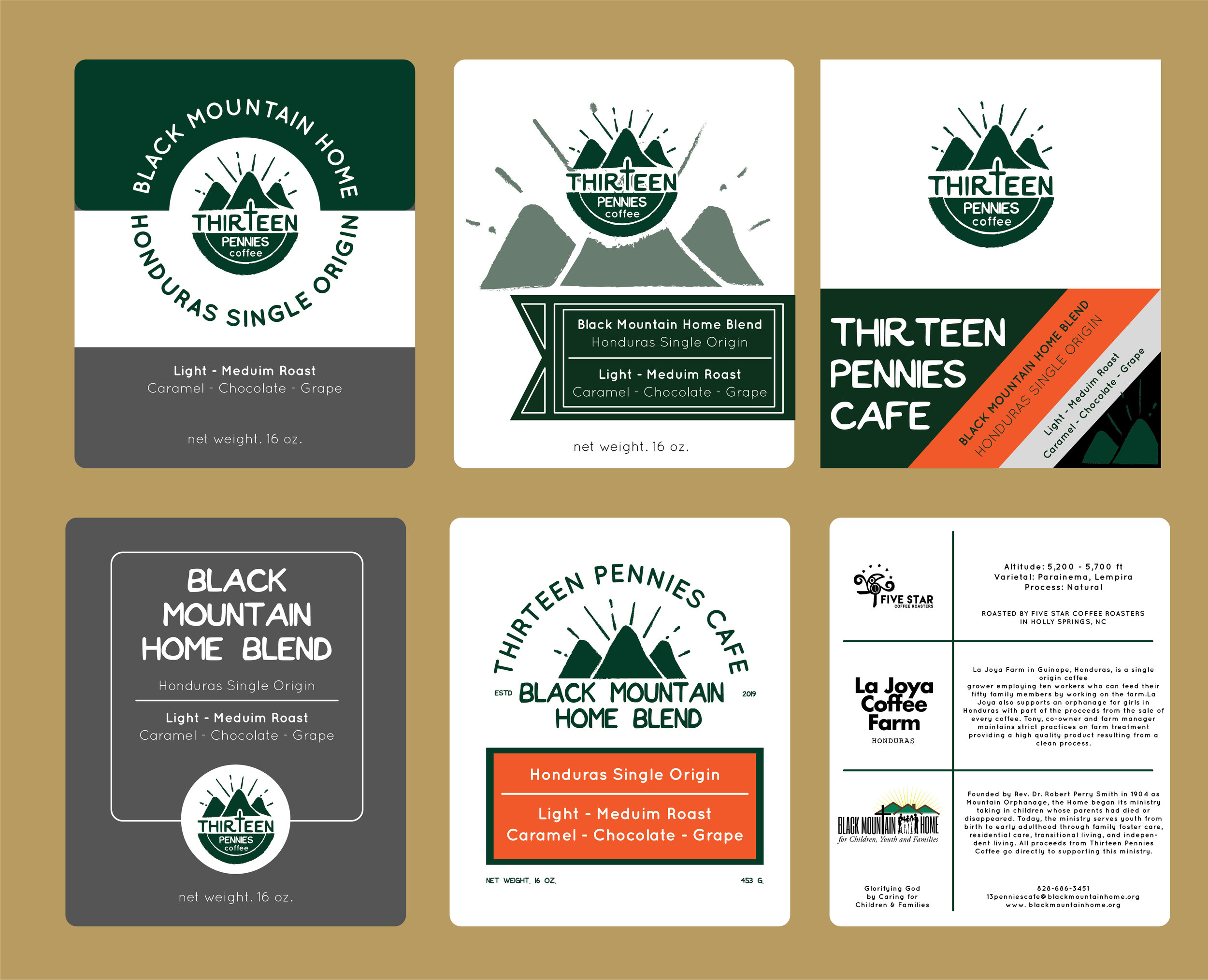
Angel certainly understands the culture surrounding coffee, but even more so, he is not new to doing design work within the coffee industry. Angel has done work for Greenville, SC based coffee roaster Out of the Grey Coffee and Black Mountain, NC coffee shop Thirteen Pennies Cafe.

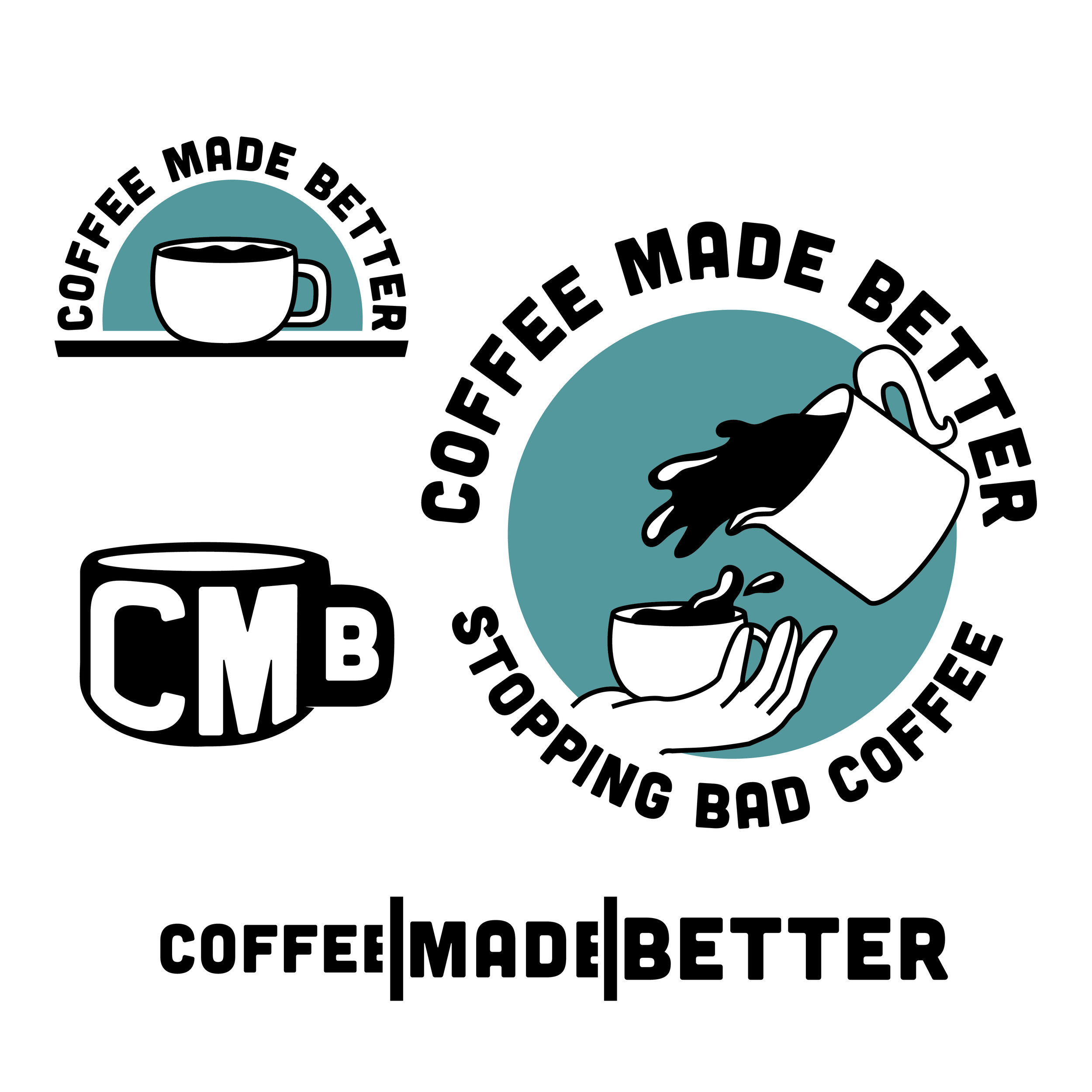
We love the clean, simple, yet original designs that we have seen in Angel’s work and were excited to see what he could do for us. We went through two rounds of logo work, pictured below is our first round of designs from Angel.
We loved the first sketches Angel sent over, however, we had become pressed with wondering how we could portray the mission of explaining the story of coffee from crop to cup. That is when the idea for our final logo came in.

The stem and leaves in our logo represent the coffee plant. This is to signify the origin of coffee and the farmers who labor in the fields. This also in many ways is to remind us of the importance of sustainability in coffee.
The pour-over in the center of the logo is to represent the process of turning coffee into liquid. While what is pictured is a method of brewing coffee, it is meant to represent all stages of the coffee process once it leaves the farm until it ends in the cup. This is to represent the craft process of roasting, grinding, and brewing coffee.
The cup of coffee in the bottom is to represent the end goal of producing a delicious product. The entire goal of the coffee process is to pull the most flavors possible out of a coffee bean and allow them to take shape in the form of a liquid that we can enjoy.
We are very excited about our new logo and what it says for our website. We hope that it is a reminder to you of the process and the many hands that go into your daily cup of coffee.
Cheers!

To learn more about Angel Martinez and his work, check him out at Angelmdesigns.com
Tell Us Your Thoughts!